Silicon Glen, Scotland >
Web usability >
Pants websites
Why the Zanussi.co.uk website is pants |
The zanussi website. Wasn't their motto "The appliance of science"? You be the judge!
We open with a search popup window. Yes, really. This is the first time I have ever seen a popup window to conduct a search. Personally, I can't stand popup windows as I rather prefer the full functionality of my browser to some cut down window that usually serves advertising, but we see here one of the coding pitfalls of popups. In an attempt to present me with a totally functionless popup, they have disabled the toolbars on my browser. However, since I have installed extra toolbars, they didn't turn these ones off making the popup window look rather odd.
Also, why is all the text repeated and what are the arrows supposed to be pointing at? Maybe rewording as "General search" and "Product search" might be better?

Moving along, I used the site search. There seems to be an identity crisis here. The URL in my browser clearly says that I'm on the http://www.zanussi.co.uk site.
However, the error reports that I'm on http://www.zanussi-electrolux.co.uk
That might explain the "no entry" sign showing at the bottom of my browser, my privacy settings blocked their cookies. This is much more likely when you have a URL identity crisis since the default setting on Internet Explorer means the cookies sent from other sites are more likely to be blocked than ones on the site I'm browsing. Also, it should of course be "your" query, not "you" query.

Now for the product search. I typed in "dishwasher", once again another woeful search. In addition to pants websites, I think a separate award for rubbish site search engines may be needed, there are so many sites that get this so badly wrong.

Next we have the email link that isn't. View this page in Mozilla and that link to contact the webmaster does nothing whatsoever.

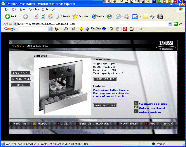
Finally the invisible text problem. Can you read the yellow text on the grey background? No, neither could I!
Zanussi "The appliance of science"